1. Describe what the “Rule of Thirds” means? DESIGN AND THEN POST (design #1) your own infographic that illustrates what the “Rule of Thirds” refers to.
Figure A
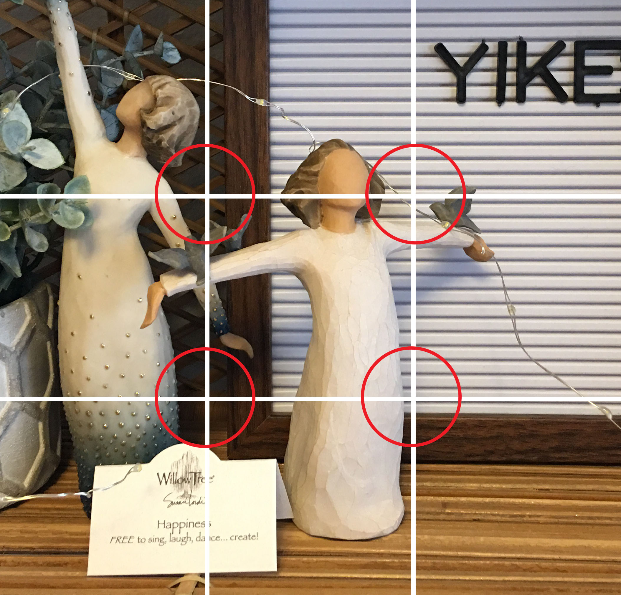
Figure B

Notice where the lines intersect. These are your focal points, anything on or close to them is typically where the eye would like to travel.
Figure A has no focal point that is on or near the intersections, Figure B has a focal point near almost every “skin”, meaning it is on or near the faces, and a hand.
Figure A-Raw Image

Figure B- Raw Image

The “Rule of Thirds” refers to the division of a picture plane in thirds, both horizontally and vertically. This is a kind of way to ensure a better composition and general appeal, rather than just placing your subject directly in the middle. The rule is, where those aforementioned vertical and horizontal lines intersect, you place your subject, or focal point.
2. Why do graphic designers consider the “Golden Ratio” when designing?” Post an example of a design that is based on the “Golden Ratio.”

(Ayumi Togashi. (n/a). Seine Deux [Print]. https://agentandartists.com/artists/ayumi-togashi/)

(
The “Golden Ratio” is another tool to be used to make a successful and appealing composition. It is a spiral closely linked to the Fibonacci Sequence, and it mathematically found in nature. As we can see, this design uses the “Golden Ratio”. Place the spiral vertically, and you will find that the dense portion of the spiral is located at a dense portion of the piece. We can also see the flowers follow the curve of the spiral. The blue shoes are also directly on the spiral.
3. What does page layout refer to, and how does a grid enhance the readability of a page layout?
Page layout refers to the arrangement of elements on a page. The grid helps establish visual hierarchy, placing the most important elements on the intersections of the grid. This allows for a clear visual path, resulting in a better readability.
